The GREEN Heart of shades

The GREEN Heart of shades

From purchasing the necessary components, in order to create specific products for a private label line, to selling them, the step may seem short. Instead, it is an articulated path, sometimes difficult, shared by different users, the result of study, analysis, resources, energy, dedication. All with one common denominator: reaching the customer’s heart.
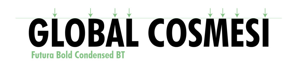
Along the highway you can see the Tiffany-colored shed of the company, semi-hidden, almost invisible, were it not for a precious metal sign, yellow and gray. Global Cosmetics.

Global, in the contemporary everyday life, perhaps refers to that sense of union, strength, trust which, in recent times, seems to have disappeared. In the humid silence of the Ferrara plain, between the gray of a six-month-long fog, fomented by the inevitable smog of the industrialized world, a group of skills put in place to be able to create successful brands, transforming gray into a symphony of customised colors.

In the logic of complete efficiency, in order to best meet the current needs of a national as well as international clientele, the Global Cosmetics departments are focused on work aimed at pursuing these needs, intersecting the guidelines dictated by the customers themselves. Dynamism, cooperation, multitasking, versatility are the key words. Here the purchasing department, followed by Federica Taddia, is the culmination of a sort of “full-service” option, which starts from the embryonic phase linked to the order of packaging and raw materials, to reach the final export stage for the export of the finished product, born from the fusion of the single elements, in coordination with the other departments. Federica, in this dual function, by managing the project from purchase to shipping, gives Global Cosmesi the possibility to offer the customer complete control of the product, thus also following the export phase, apparently complex, as necessary, on the day of ‘today.

With a view to complying with all the procedures envisaged, following the trends and the continuous regulatory changes, the entirety of the functions of the various departments becomes synonymous with efficiency, with a common goal: to give concrete form to customers’ ideas. Where the Tiffany light blue is colored, tinged with a thousand shades, involving the GREEN background that the planet asks us, in spite of itself, to respect.

Each sector, in the correct succession of its tasks, prepares the work for the next step, with the intention of reaching the same goal. The satisfaction of the individual is transposed into the satisfaction of many. This creates the whole. This is Global Cosmesi.

#weareproudtoputournameonit

Federica_taddia_Green_private_label

Share:

THE SUCCESS OF A PRIVATE LABEL LINE STARTS FROM THE MARKETING STRATEGY

THE SUCCESS OF A PRIVATE LABEL LINE STARTS FROM THE MARKETING STRATEGY

Brands are like individuals because they must be told and valued to make them unique and distinctive. Identity is created in the details.
For this reason, even the approach of a private label project should always be proposed with the values ​​of a brand because to be successful a product must be developed starting from shelf positioning.

For this reason, the Marketing department of Global Cosmetics, directed by Silvia Conconi who comes from branding experiences from well-known multinationals, transforms the proposals of private label projects into ready-to-sell brands, coordinating all the details: from the pack to the colors, from the narrative communicative to the novelties of the active ingredients that can build a strong and compelling story telling. This leads to the construction of the identity, personality and equity of the brand and product.

We like to build a dream and not a list of information. We put the brand at the centre and make it dialogue with the market through the construction of its universe of values. We translate the benefit into a correct strategic vision, transforming the need into good tactical ability and adding clear ideas to an effective narrative ability “. And it is precisely the narrative ability and the ability to enter the heart of the product, emphasizing every detail, which has allowed many of our customers to launch successful brands.
Another valuable ally in the interpretation of the communicative scenario is the interest in the world of fashion, interior design and visual merchandising which allows us to intercept trends and trends and bring them into the world of cosmetics.
Creativity and the ability to structure strategies to bring out the brand and distinguish it are the elements that have allowed us in a short time to develop new customers both in Italy and abroad.

“Each product on the shelf must transfer valuable information, but also emotions and personality to the end customer. The product must live taking into account all the sensory aspects such as textures, colors, scents and sensations, without losing sight of the green approach that is the basis of our proposals “.

We always offer new marketing concept with different solutions of functional substances and active ingredients in line with a communication increasingly requested by “GREEN” consumers who are informed and attentive to a clean and sustainable INCI: active from organic farming and vegans, gluten-free active ingredients, Italian active at ZERO KM for those who want a strong Made in Italy connotation.

Let’s not forget that everything can be crowned with green packaging such as post-consumer recycled plastics or plastics derived from sugar cane, packs with refills to avoid waste, glass or FSC papers for increasingly ECO SUSTAINABLE cosmetics.

If you want to create your line or your product through a BRAND EQUITY and BRAND IDENTITY approach, personalized and tailored to your sales channel, contact us for all the details.

#Weareproudtoputourname

IL SUCCESSO DI UNA LINEA IN PRIVATE LABEL PARTE DALLA STRATEGIA MARKETING

Share:

IL SUCCESSO DI UNA LINEA IN PRIVATE LABEL PARTE DALLA STRATEGIA MARKETING

IL SUCCESSO DI UNA LINEA IN PRIVATE LABEL PARTE DALLA STRATEGIA MARKETING

I brand sono come individui perché devono essere raccontati e valorizzati per renderli unici e distintivi. L’identità si crea nei dettagli. 
Per questo anche l’approccio di un progetto in private label dovrebbe essere sempre proposto con i valori di un brand perché per avere successo un prodotto deve essere sviluppato partendo dal posizionamento a scaffale.

Per questo motivo il dipartimento Marketing di Global Cosmesi, diretto da Silvia Conconi che arriva da esperienze di branding da note multinazionali, trasforma le proposte dei progetti in private label in marchi pronti alla vendita, coordinando tutti i dettagli: dal pack ai colori, dalla narrativa comunicativa alle novità dei principi attivi che possano costruire uno story telling forte e avvincente. Si arriva in questo modo alla costruzione dell’identità, della personalità ed equità della marca e del prodotto. 

“Ci piace costruire un sogno e non un elenco di informazioni. Mettiamo al centro la marca e la facciamo dialogare con il mercato attraverso la costruzione del suo universo valoriale. Traduciamo il beneficio in corretta visione strategica, trasformando il bisogno in buona capacità tattica e sommando le idee chiare a una efficace capacità narrativa”. Ed è proprio la capacità narrativa e la capacità di entrare nel cuore del prodotto, enfatizzando ogni dettaglio, che ha permesso a molti nostri clienti di lanciare brand di successo.
Un ulteriore prezioso alleato nell’interpretazione dello scenario comunicativo è l’interesse al mondo della moda, dell’interior design e del visual merchandising che consente di intercettare trend e tendenze e portarle nel mondo della cosmetica.

Creatività e capacità di strutturare strategie per far emergere la marca e distinguerla sono gli elementi che ci hanno consentito in poco tempo di sviluppare nuovi clienti sia in Italia che all’estero.  

“Ogni prodotto a scaffale deve trasferire al cliente finale informazioni di valore, ma anche emozioni e personalità. Il prodotto deve vivere tenendo conto di tutti gli aspetti sensoriali come texture, colori, profumi e sensazioni, senza perdere di vista l’approccio green che è alla base delle nostre proposte”.
Offriamo sempre nuovi concept marketing con diverse soluzioni di sostanze funzionali e principi attivi in linea con una comunicazione sempre più richiesta dai consumatori “GREEN” informati ed attenti ad un INCI pulito e sostenibile: attivi da agricoltura biologica e vegani, Attivi italiani a KM ZERO per chi desidera una forte connotazione del made in Italy, attivi senza glutine.

Non dimentichiamo che tutto può essere coronato da packaging green come plastiche riciclate da post consumo o plastiche derivate dalla canna da zucchero, pack con refill per evitare sprechi, vetro o carte FSC per una cosmetica sempre più ECO SOSTENIBILE.

Se vuoi creare la tua linea o il tuo prodotto attraverso un approccio di BRAND EQUITY e BRAND IDENTITY, personalizzato e su misura per tuo canale di vendita, contattaci per tutti gli approfondimenti.
#noicimettiamolafaccia

IL SUCCESSO DI UNA LINEA IN PRIVATE LABEL PARTE DALLA STRATEGIA MARKETING

Condividi:

ENVIRONMENTAL LABELING: the new regulations

etichettatura_ambientale

Etichettatura ambientale: le nuove normative.

Designing, manufacturing and placing packaging on the market today cannot ignore the evaluation and consideration of the environmental and eco-compatibility aspects that it must have.

The different functions of packaging are now closely connected with the environmental variable, not only because the European and national legislator has placed its attention on it, but also because the final consumer has become more demanding in this regard. The Institute’s Environmental Commission, which works with the aim of monitoring developments in environmental policies and regulations on packaging to inform and disseminate this knowledge among economic operators, could not therefore fail to deal with such a crucial topic as environmental labelling, which should summarize, through a few symbols, the path of eco-sustainability that a specific package or packaging must follow at the end of its use.

From December 2021 it will be mandatory to include environmental labeling in all packaging, to facilitate the final consumer in the correct disposal of waste according to the principles of recycling.

For some years now, environmental labeling on packaging has been introduced on a voluntary basis and many companies have joined it; but with the mandatory introduction of the latter, there are many doubts about the information to be included on the label and the various types of materials. Let us try, through this article, to clarify.
It is the legislative decree 116 of 3 September 2020 that defines the rules on environmental labeling which, in line with the European Directive EU 2018/852, establishes how all packaging must be labeled so that the final consumer can arrange for their recycling in a simpler and faster way, to dispose of them correctly.

First of all we have to distinguish single-component from multi-component packaging:
for single-component, the company is obliged to report the coding of the material in accordance with decision 97/129 / EC and the indications on the collection. The following information must necessarily be reported:
– The identification code of the packaging material.
– The information on differentiation, with a formula for example: “plastic recycling” and to invite the consumer to check the provisions of their municipality (eg. Paper recycling. Check the provisions of your municipality).
The same subdivision also applies to multi-component packaging that can be separated manually, adding the description of the type of packaging for each component (eg cap, bottle, pump, jar ..)

For multi-component packaging systems, the company is required to distinguish the parts that cannot be separated by hand from those that are. All components that can be separated from the main packaging only by hand are considered to be separable by hand, without the help of other tools and without risk. Each component that can be separated from the rest of the packaging must bear the coding of the material and the indications on separate collection if they are not already indicated on the outer packaging.

A typical example of parts that cannot be easily separated by hand is that of a plastic bottle with an adhesive paper label, where it is not necessary to specify the data relating to the label alone.

Often, it may happen that there is not enough space inside the packaging, label or wrapper for the insertion of environmental labeling. In these cases, unfortunately, the rule does not provide for any exemption for small packaging / packaging, with reduced printing space or the inclusion of multilingual. The Ministry of Ecological Transition has issued a note, on May 17, 2021, where it clarifies, that where there are limits of physical spaces for the insertion of environmental labeling, or a poor readability of the information, these can be conveyed through digital channels or made available through the websites of the company and / or the retailer.

A practical solution could be the use of the QR code; a two-dimensional barcode, ie a matrix, consisting of black modules arranged within a white square pattern, generally used to store information intended to be read via a special optical reader or even a smartphone.

To answer the many questions of companies, CONAI (National Packaging Consortium) has developed the platform  http://www.etichetta-conai.com/ dedicated to the topic, to help companies adapt to the legislation that will come into force from 2022, and provides an online tool called E-TICHETTA http://e-tichetta.conai.org/ to independently create the environmental labeling of their packaging.

Fonte Immagine: sito Conai

Fonte Immagine: www.cnaveneto.it

Fonte Immagine: www.cnaveneto.it

Fonte Immagine: www.cnaveneto.it

Share:

THE IMPORTANCE OF WHITE SPACE!

THE IMPORTANCE OF WHITE SPACE!

What is white space for a graphic designer? In spite of what one might think, the white space, also called “negative space”, is not only to represent a gap between the various components of a graphic, but it represents a real fundamental element for the correct functioning. Whether it is a layout or a label, the latter represents one of the most important elements intentionally created to emphasize other elements within the graphics, thus conveying a mood or a specific message. If this essential element is not considered by the graph it is a serious mistake.

White is a constant and a certainty; It represents purity and balance. It is precisely this balance that dictates the union between the various elements by regulating and transmitting a pause signal to our brain, facilitating reading and facilitating the understanding of the contents. Especially when dealing with important texts, white spaces are essential because they mark the reading.

White space can be divided into two components: macro space and micro space based on how it is distributed within the page layout.

THE WHITE MACRO SPACE: it is the space between the main elements in the layout that acts as a container for the whole design.
Just think of the Google homepage.

Screen Google home page

Here is the comparison with the mozilla firefox page which, unlike google, used a gray pantone that makes the page more closed and limited.

Mozzilla_screen_home_page

THE MICRO WHITE SPACE: it is instead the space between one paragraph and another, between a title and the beginning of the text, between an image and the caption, but also the space between individual words or individual letters.

Reading speed and comprehension are affected by the arrangement of the text with respect to the margins.
Let’s see some examples.

The first example is much more readable and fluent; in fact, the white space around the text and between the individual words and letters lightens the text unlike example no. 2 which, due to the dark background and the limited space between individual words, makes reading difficult.

The same reasoning is used on the Web as well; here are some examples. From the news pages to the sites of major brands such as Apple, this element makes the entire page balanced, making it easier to read and understand the message.

In recent years, minimalism has been associated with modernism, and brands have been quick to adopt this style. White space is extremely useful in web design as it can help developers create sites that are easy to navigate; helping the user in faster and more immediate navigation.

Website evolution example.
Website in 1997
Website updated in the 2000s


This element also plays an important role in the cosmetics sector. Packaging is one of the key elements for the success of cosmetic products as it directly and actively influences their sale. This sector is populated by numerous similar but not identical products, often distinguishable only thanks to the packaging and graphics.

Precisely for this reason, the creation of packaging has always required numerous design and communication efforts by the marketing and graphics sector. In the previous article we addressed the importance of colors Communicating through colors. Today, however, we only analyze a single color that lays the foundations for correct graphics: white.

As we have seen so far, white space can create a high quality look, especially when the rest of the design elements (text, fonts, graphics …) are elegant or modern in style. Using white inside a packaging conveys a sense of cleanliness, purity, efficiency and simplicity. It is often associated with sustainability; highly requested in recent years and positively evaluated by consumers.

As manufacturers of cosmetics for face, body and hair care,  we develop full service private label projects and give shape, substance, color and perfume to every cosmetic inspiration.

We develop the product in complete collaboration with the customer: from its formulation, to the graphic layout, to the search for active ingredients or special raw materials, arriving at complete customization.

Share:

THE WORLD OF FONTS

THE WORLD OF FONTS

During the creation of a new brand, the graphic designer will have to face an often very thoughtful choice: the choice of the most suitable font. In fact, these are considered real graphic elements on a par with color (news link the importance of colors) that speak and bring a silent message to the human mind. For this reason it is important to know how to use them correctly.
With the invention of typography and the creation of characters, it has become an indispensable part of communicating the message. In addition to the content itself, the author was able to arouse sensations in the reader also with the help of characters / fonts. This principle has remained until today. The choice of a font is, in fact, a crucial aspect in the process of creating a logo but also in any other aspect of graphic design. This concept applies in many sectors such as the creation of a label, a book, a newspaper, a logo, a brochure ect.

Fonts can be divided into different types:

  • Font Serif: are all those fonts that have elongation at the ends: the so-called graces. These transmit elegance, tradition, authority, reliability. These help to direct the gaze to be able to read the printed text more easily. Ideal for law firms, doctors and academia.
  • Sansa Serif Font: in French <sans> means <without>. They are therefore without grace and communicate immediacy, clarity, balance, sobriety, modernity and for this reason they are used in different contexts and sectors.
  • Calligraphic Fonts: are those fonts that seem handwritten and express youth, creativity, imagination and originality.
  • Monospaced characters: linear characters where each letter has the same horizontal width. These types of fonts have always been used in word processing programs as they have good readability.
Caratteri Monospaced font

Another particular aspect of fonts are the optical corrections that are made by the graphic designer. Have you ever noticed how often, in some fonts or graphic projects, there are elements that are not perfectly aligned in a geometric way? Let’s see some examples together to better understand the concept.
In the image below I used a very simple Futura and we can see how there is a great misalignment of some letters compared to others.

Usually it is not a detail that is noticeable optically, but all this is due to the optical corrections made. But let’s see together what we are talking about and why they are so important in the creation of new projects, logos etc.
By optical corrections we mean all those tricks and changes that are made to some graphic elements to ensure greater harmony and a more pleasing optical effect.
In English we can call it Overshooting typography that is “passing over”; create an optical illusion such that the letters with curved parts and those with flat tops appear to be of the same height even if they are not. All this happens because what we see through our eyes is mediated by the receptors of our brain and it gives us a representation based on our knowledge and experience. Just think of Gestalt theory, which is based on the awareness that our brain processes and reconstructs what it receives from the eyes.

teoria della Gestalt

Precisely for this reason, optical corrections are essential to know and to exploit for the creation of a new brand or logo. Having the awareness of how our brain reacts to certain stimuli and forms, we can use this knowledge to our advantage and as our ally, making everything more harmonious, thus overcoming the classic geometric pattern which is often not enough.
Obviously in this sector the topics to be talked about are many and this just seen is a small taste. We as global cosmetics also take care of the development of your brand taking into account all these small details that actually make a big difference.

Share:

COMMUNICATE THROUGH COLORS

COMMUNICATE THROUGH COLORS

The psychology of colors

Within the article on “Correct Visual Communication: packs and labels” we touched on a fundamental point for the creation of a new Brand: the psychology of colors applied in the world of marketing. What is it about? Color psychology is the study of colors in relation to human behavior. It aims to determine how color affects our decisions in daily life, especially when purchasing products compared to others. Each individual perceives a specific color differently from each other; this depends on the story, the sex, the context in which the latter is located. However there are universal guidelines to follow. Just think of the supermarket aisles, there are predominance of color by sector, cold colors for detergents and warm colors for food areas.
Nothing is put there by chance, everything is meticulously studied to capture the customer’s attention. In fact, according to a study, 92.6% of consumers declare that color is the main element that conveys their purchase, while only 5.6% is based on the tactile sensation and the remaining 0.9% on the sense of smell and hearing. Precisely for this reason there is the psychology of color, a tool with which to determine the failure or success of a new brand. In cosmetics, as never before, all this is fundamental to know for the realization of a new brand and cosmetic. Inside the staff of Global Cosmesi there are people also prepared for this, entrusted to us for the creation and creation of your new brand, starting from the creation of the cosmetic formulation to move on to the graphic realization of the finished product.

Share:

BEARD CARE IN CORONAVIRUS TIMES

BEARD CARE IN CORONAVIRUS TIMES

This year has undoubtedly brought a revolution on many aspects of everyday life, including outfits. But the men’s beard still does not go out of fashion, indeed the trend is also developing in the wake of the trends “imposed” by the Coronavirus.
In the wake of the latest trends, also in 2021 the style to be preferred is certainly that of a controlled and well-groomed male beard, not only for a matter of style but also for a hygienic discourse.
From this year, in fact, we need to be much more attentive to hygiene and personal care, and certainly wearing a shorter beard means more cleanliness.
The short beard also makes it easier to deal with the use of the mask. Wearing the mask on a long hipster-style beard can be difficult, it could get entangled but above all you would risk leaving your mouth or nose exposed or not completely protected.
In 2021 they will wear short or medium-short beards and mustaches, and also for hygiene reasons it will be good to focus on a more refined cut.
Beard shampoos are suitable for cleansing, especially for considerable lengths.
For daily care you can choose between a No rinse balm or a few drops of beard oil, they have an emollient effect even for the most bristly beards, making them soft to the touch and giving shine. The underlying skin will also benefit, as it is richly nourished and hydrated.

Global cosmetics has developed a line for these needs. Ask for information to develop your line.

Share:

CLEAN BEAUTY

Have you ever heard of CLEAN BEAUTY'?

Cleancosmetics is still evolving in purity and plays with the idea that it could even be eaten and is therefore now called ‘baby proof’, with components so pure and reliable that they are proof against children who might mistakenly taste them. In fact, these are not products to actually eat but a new category of cosmetics containing ingredients that are originally edible and that grow at a surprising speed of 200% per year (Nielsen 2018) and that was created to meet the growing needs of consumers more attentive to green, natural and organic.
“68% of consumers expect greater transparency from the beauty and personal care industries. These are highly trained customers, who know the formulas, ingredients and sources preferring organic, clean, natural, green cosmetics and who instead discard those based on ingredients suspected of being toxic, such as silicones, essential oils, fragrances, sodium lauryl sulfate, chemical filters and alcohol. 53% of consumers argue that the absence of these components is more important than the possible effectiveness of the products. The success of cosmetics based on edible ingredients is linked precisely to the strong and growing demand for safety “.
And if this cosmetic is associated with a pack with bio based or post-consumer recycled plastics, you can create a that goes beyond green certification. A new cosmetic frontier that few companies are able to formulate and propose.
Global Cosmetics has succeeded! Contact us for all information and develop your skincare line with us.

Share:

Wecosmoprof 2020: Global Cosmetics is present

wecosmoprof_2020_globalcosmesi

Wecosmoprof 2020: Global Cosmetics is present.

The edition of Cosmoprof on Line, the most important world fair dedicated to the cosmetics and wellness sector, which this year will be on the digital platform due to Covid, begins on 5 October; 14 consecutive days of beauty, avant-garde and novelty which Global Cosmetics together with its Brands, ESTETICARE Happy beard and Staysafe, could not miss.
With this presence, our brands add a stage of fundamental importance to the path of growth and development considering that they are young brands that are just born and are entering the international market for the first time.
We believe in what we do and we are convinced that to continue to grow it is essential to improve day by day. This is why we are at the fair. To present the new products under the ESTETICARE, HAPPY BEARD and #STAYSAFE brands and to face the international market for which we feel similar and ready with ever greater awareness.

Share